
Resource by Jade Found
Introducing the new Icon generator tool available to all instructors at our college. The tool was created to assist instructors with generating eye-catching icons. Adding labels with icons to a Moodle shell is a great way to help visually break up information, but… it’s best practice to ensure these aids also aid those who may not see them.
What does that mean?
While icons are a fun way to jazz up our Moodle shells, we also need to consider how a user with an assistive device (such as a screen reader) or a user with low vision will interact with these elements. Our goal here, ensure all users have the same level of interaction with the content. But it’s just an icon with some text, what’s the big deal? While we can see the icon and read the label, assistive technologies or those with low vision may not see the content, thus affecting the user interaction. If our label said “Important. Please Read” in an image or has insufficient contrast, how would our user know that that content is important and needs to be read. But wait, I put alt text? Imagine this is where you find out that text you needed to review before class needed to be read… awkward. Let’s go through how this tool is effective is generating AODA compliant content.
How to use the Icon Generator
Access the file via the 2026 Moodle Shell Template or by visiting teaching.cambriancollege.ca/IconGenerator/
Step 1
Use the “Icon” drop down menu to select your icon.

These icons will look familiar. These are our universal Moodle icons!
![]()
Step 2
In the Label Text form field, leave or customize the text associated with your chosen icon.

Step 3
Choose your bubble colour using the Background Bubble form field.

Above this form filed you will see:

The generator will auto adjust the colour of your icon in relation to your chosen Background Bubble colour…but… it’s not perfect. Should your icon not adjust to the correct colour for accessibility, you can manually choose white vs back for the icon in the Icon Tone form field.
Step 4
Update the text element using the Text Element form field. So what is this, and why does it matter? This dropdown lets you choose whether your label text should be paragraph text or a heading (H3–H5). Think of it like Microsoft Word’s built-in headings… when we tell Word what’s a heading and what’s regular paragraph text, we’re creating a hierarchy and labeling the structure in the background. That’s what allows Word to build a live table of contents.
We need that same hierarchy inside our Moodle shell. It helps screen readers and other assistive tools understand the structure of the page. And, because Moodle already uses H1 and H2 outside of our shell, we avoid those levels. If this label is your main heading for the section, choose H3. If it’s more of a simple guide or supporting text, choose Paragraph.

Step 5
Our next step is a doozy. Use the Match Text Colour to Bubble? form field to determine if the text will match the Background Bubble or display as black.

But wait i’m getting a contrast error!
![]()
Not only does the generator check the contrast between the icon and the background bubble, it also double-checks that your label text meets contrast requirements with its background.
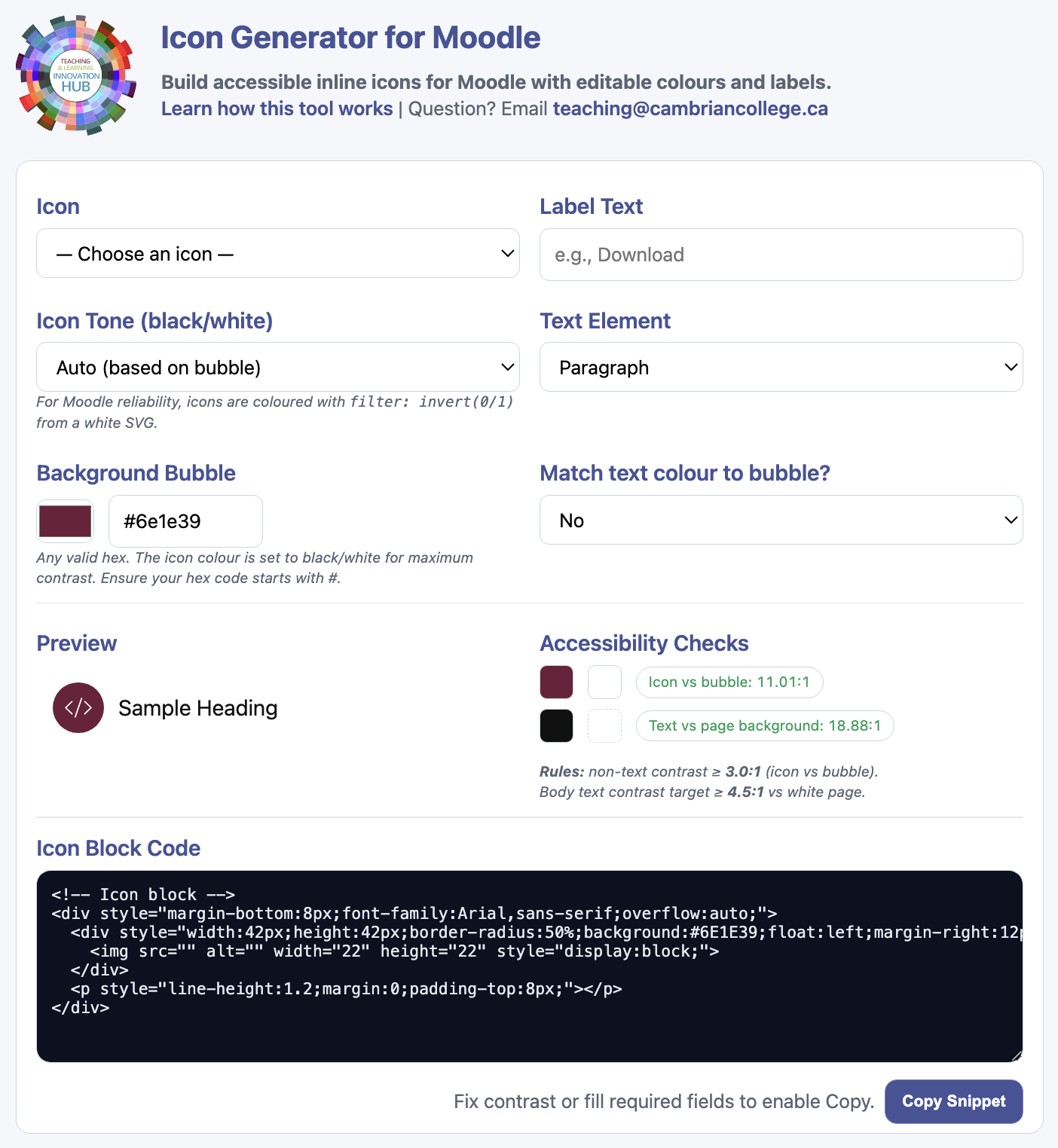
Step 6
Time to review our final icon! Once the icon and text has been customized, we can review the final look in the Preview section and review for accessibility by reviewing the Accessibility Checker section.


If you don’t see the message “Insufficient colour contrast detected” on your screen, then you are good to go to Step 7.
![]()
Step 7
Once the icon has been reviewed, we can go ahead and copy our new HTML code. This can be done two ways.
- Copy the code from the Icon Block Code section.

- Use the Copy Snippet button.

Final Boss
Lastly we need to paste our new HTML code into Moodle. Open the editor’s menu in your Moodle and select View → View HTML to paste the code directly into your shell.


